How to Add Real-Time Annotations to Power BI Line Charts (No Custom Visuals Required)
There are 4 levels of analytics maturity:
1. Descriptive (what happened),
2. Diagnostic (why it happened),
3. Predictive (what will happen),
4. Prescriptive (what should we do)
But most organizations get stuck between levels 1 and 2. And it's often the case level 2 is completely disconnected from the data.
Here's why: Traditional BI tools excel at descriptive analytics, but fail catastrophically at diagnostic analytics. They show you the trend, but the "why" disappears into meeting discussions and email threads.
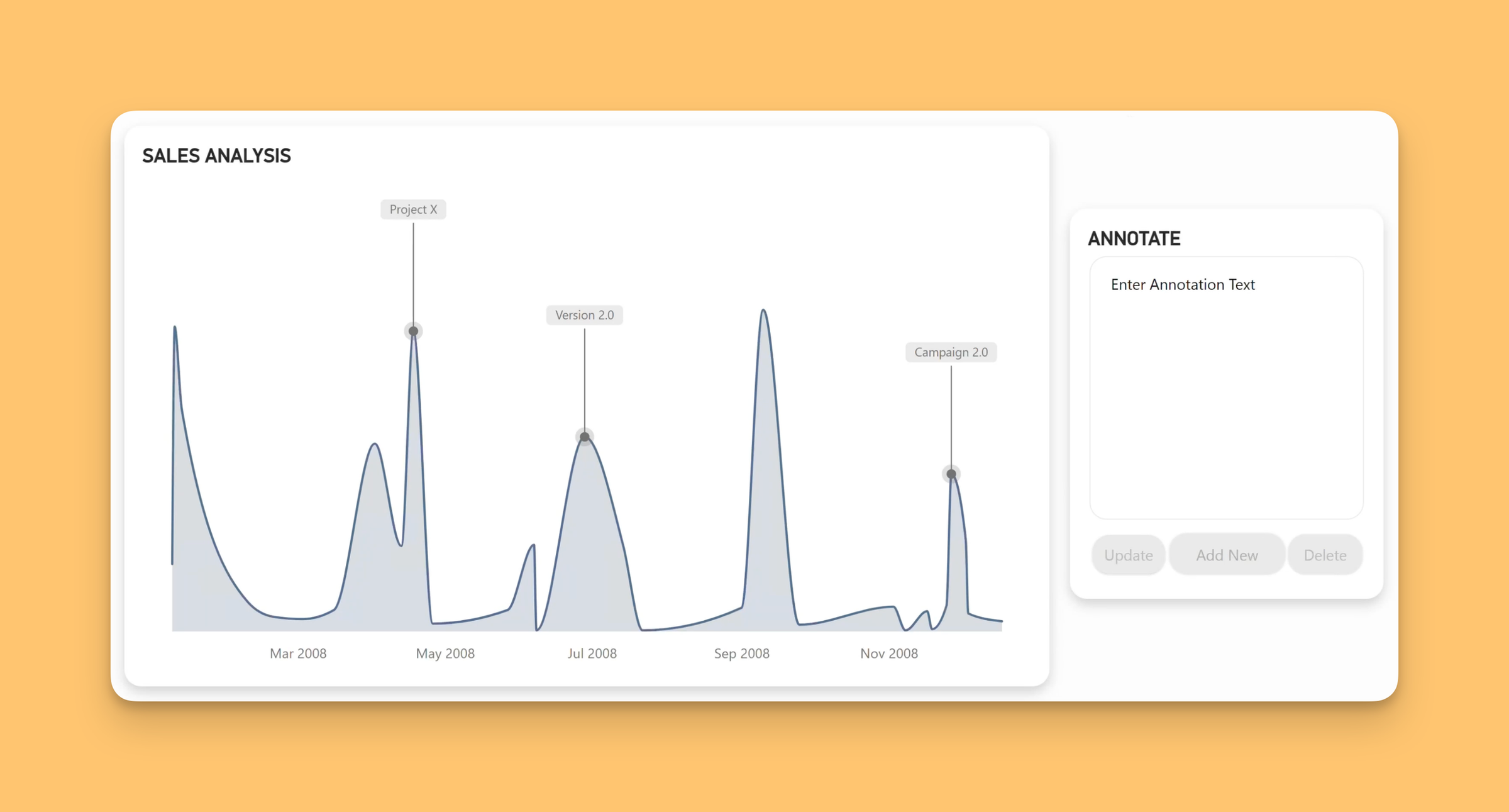
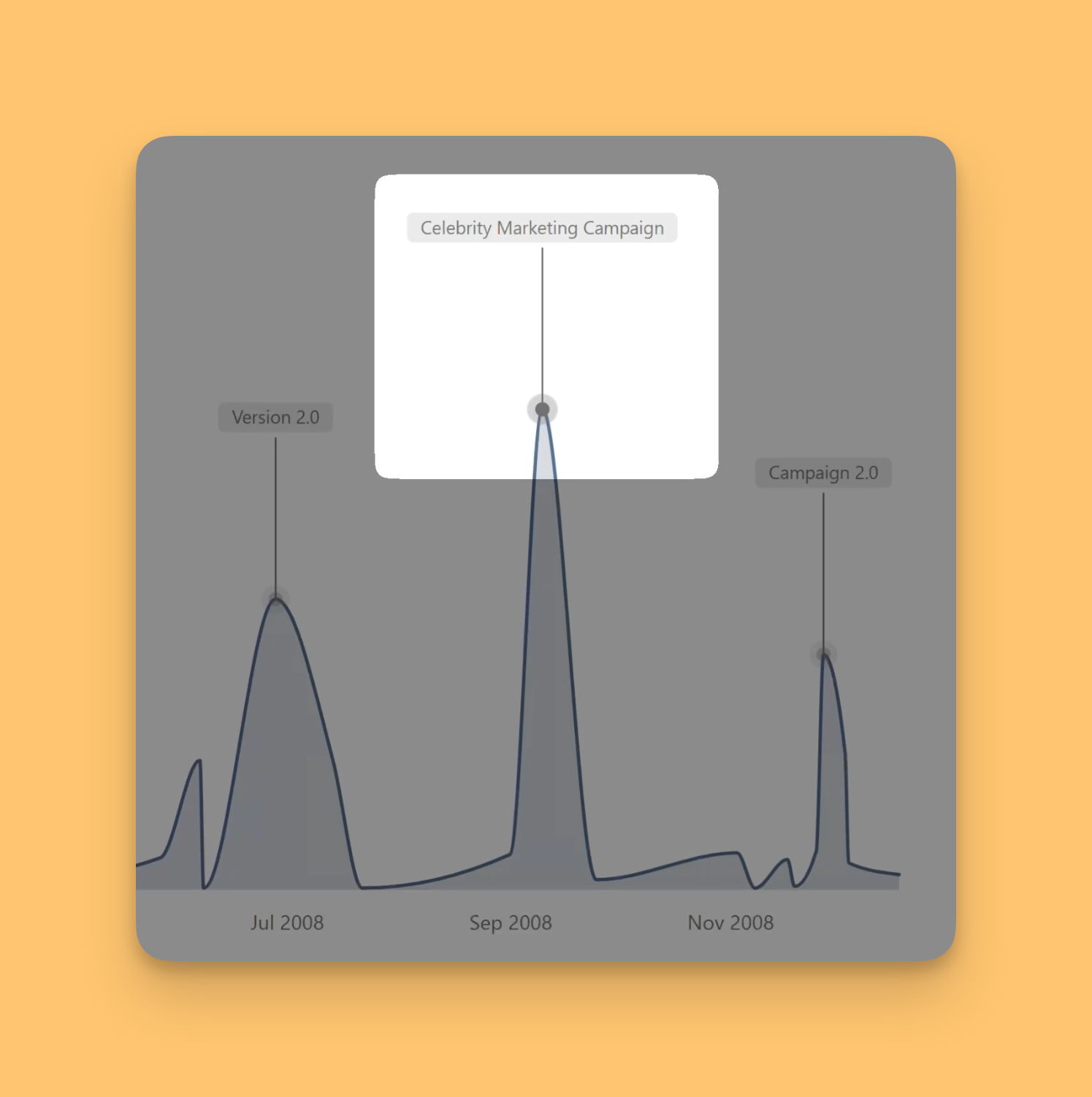
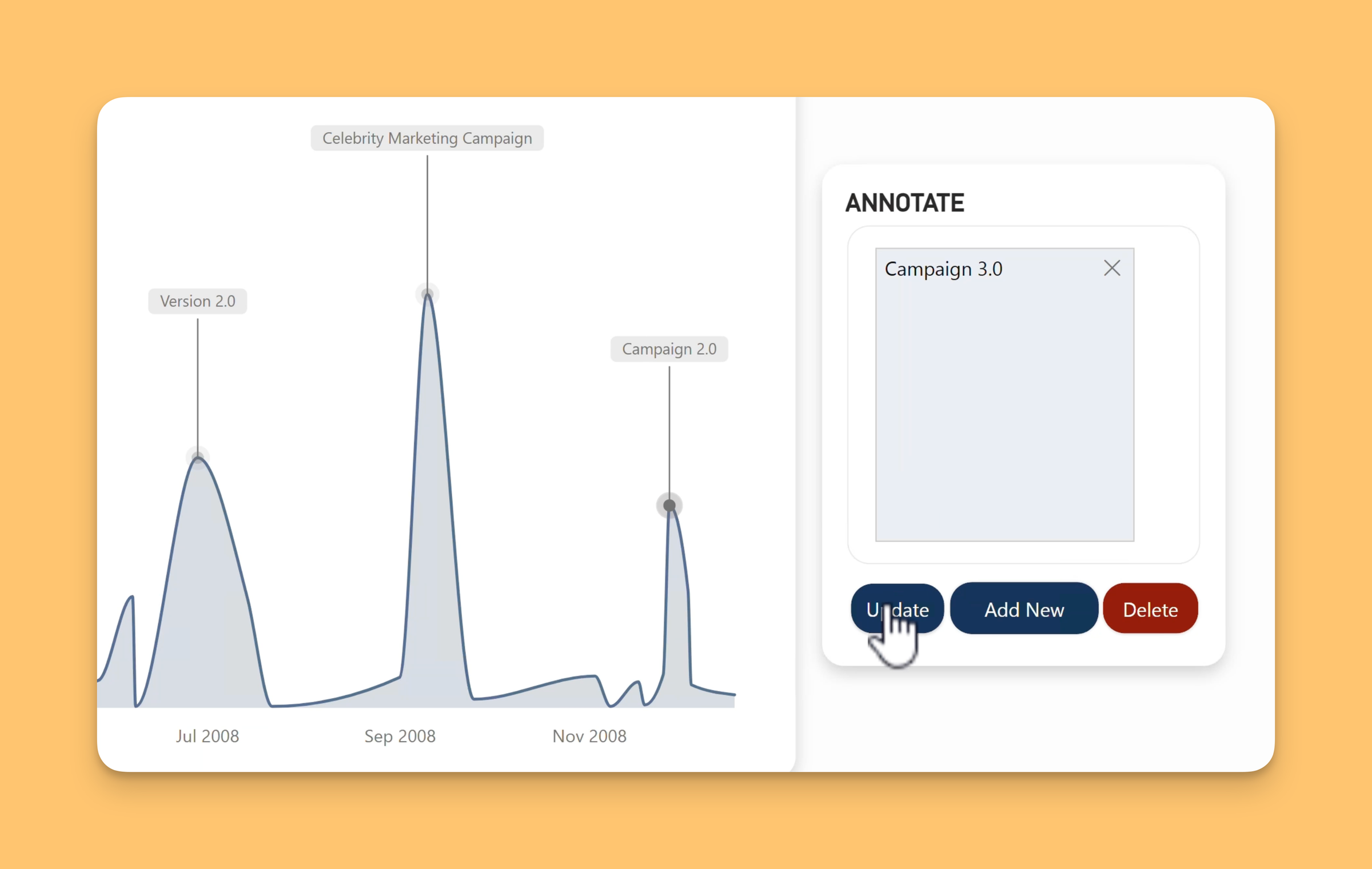
I just solved this gap with real-time annotations in Power BI that capture diagnostic insights directly within charts. All thanks to the new native writeback (or translytical task flows as Microsoft calls it) functionality, sprinkled with usual Power BI magic 🪄.
Now when teams see a sales spike or performance dip, they can document the market conditions, strategic decisions, or external factors that drove those results - preserving that critical diagnostic knowledge.
The Analytics Maturity Reality:
• Descriptive: "Sales dropped 15% in Q3"(Every BI tool does this)
• Diagnostic: "Sales dropped due to competitor pricing + delayed product launch" (Lost in conversations)
• Predictive: "Q4 will likely recover based on pipeline" (Built on incomplete understanding)
• Prescriptive: "Accelerate launch timeline + adjust pricing strategy" (Missing context)